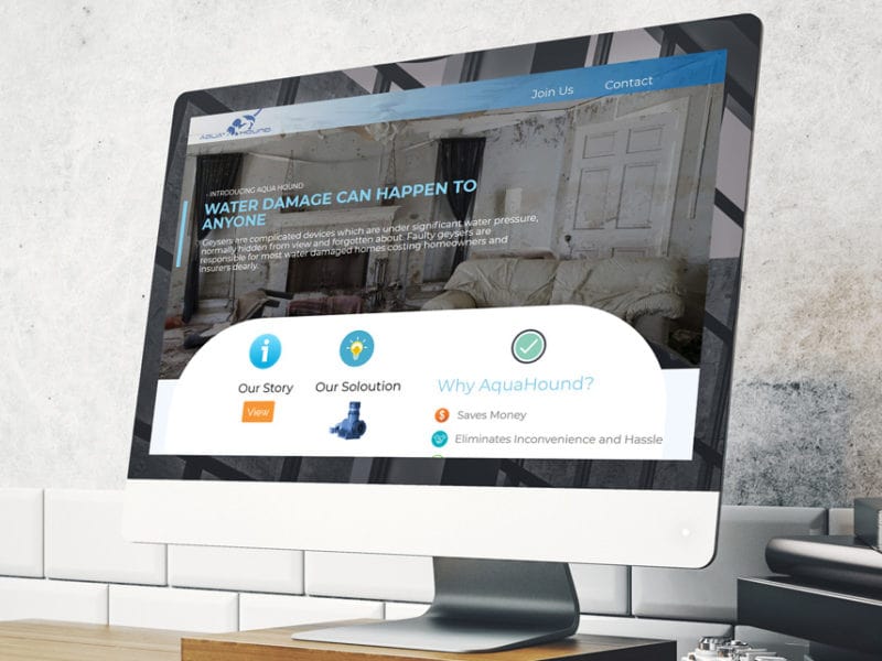
Stunning appearance and attractive colors, impeccable navigation, calls to action, there are many ways to increase the conversion of web resources. All methods are important for creating a friendly image of the site. Colors, as tools of web designers, should be used properly, taking into account the target audience and type of business.
A leading specialist in internet marketing, 85% of successful sales depend on the color design of the product. This means that colors can affect the final conversion of the site. Web design experts try to focus on colors, understanding their psychological impact on users and selecting the most effective solutions.
In this article, you will encounter various aspects that can affect the use of colors in web design and learn what each specific color means. You just have to know about it to avoid mistakes when developing your new web project.
Colours influence human behaviour
Certainly, colors can influence a person’s behavior and decisions about buying goods. From health to healing, from shopping to entertainment, colors matter everywhere.
Correct use of color schemes when creating a site – the ability to attract the attention of the target audience. The work of web designers is to select the best colors for the site in accordance with its subject matter.
The most suitable colors for web design
Choosing the best color solution for your site, you should already know everything about your potential users. If the site sells sports goods for children, try to avoid the use of black in the design. Instead, use bright colors – red, green, yellow, etc.
For the site of women’s accessories using brown or orange colors – not the best choice. Much more profitable here will be black, purple, white.
What men and women prefer:
- Women prefer purple, green, blue; much worse are brown, orange, gray.
- Men prefer black, green, blue; do not like orange, brown and purple.
Color values
Blue is the color of trust.
Blue is often seen as the color of peace, tranquillity, trust and loyalty. For example, many payment systems and banks use it very actively.
However, the blue color is not quite appropriate for sites dedicated to food and restaurants, as it can suppress appetite.
Yellow is a warning sign
Yes, yellow is very often used to prevent some actions. However, from the point of view of business, it is considered the color of joy and friendliness. Remember, yellow is best used in small doses, because it tends to excite brain activity and raise people’s anxiety levels.

Green: nature and the world
Green is the color of the environment, nature and the world. It is also capable of unleashing its creative potential. This color is best used on sites dedicated to nature and the environment.
Orange is the color of activity
Orange helps to awaken physical activity and confidence. That’s why this color is very actively used to create sites about sports and sporting events.
Black: Aspiration for luxury
Dark tones in the design of sites almost always indicate luxury. Black – a classic color, over which time is not in control, it has always been considered the color of glamour and sophistication. Black magic is best reflected, for example, by the Lamborghini website.
White cannot be ignored
Google – top search engine – a vivid example of a successful site in white. Some people in vain do not include this color in the list of the most used colors. White is the color of freedom.
Using bright colors
Four main bright colors are always used for call to action: yellow, orange, red, green. Dark tones such as black, purple, brown, grey do not have such an impact on users that they want to perform the action required of them.
However, we recommend that you do not follow traditional approaches when choosing a color scheme for your site. Do what you think is most attractive to your audience. Don’t rely only on the web designer to do this, give your opinion and share it with your artists who help you create your project.
Mutual understanding is a great chance to achieve a high positive result. Try to avoid overloading the site with a large number of colors.
With the help of colors you can create a certain impression of the resource. Wrong impression will not bring success to the site. That’s why the unprofessional approach to choosing the color scheme of the site indicates the professionalism of its owner. Web designers and resource owners should know the psychology of colors and be ready to properly assess their relevance to a particular business.

